Wednesday, 29 February 2012

Film Posters


- Clear, easy to read font is used
- Protagonist is on poster
- Title is in the center of the thirds
- A tag line is used
- The clothing the characters wear in the poster gives away their personality
- Background usually shows a feature of city life/film location
- Other films created by the director are sometimes mentioned
- The first item the eye is usually drawn to is the title     
- white is a dominating colour commonly used    


This is England - Website Deconstruction


  • Background is of high rise flats usually found in the city, however this photo has luscious green grass and blue sky which creates a sense of freedom.
  • The colour schemes are in keeping with the film title 'This is England' and is made up from the Union Jack.
  • The Font is in the same colours of red, white and blue and is a basic, bold font in capital letters. 
  • On the opening page, the trailer is present and plays as soon as the site is entered making it the main focus of the website.
  • There are 2 highlights towards the DVD and another towards all film merchandise. The header of the page shows when the DVD is out and the bottom left corner shows the image of the DVD and a link to pre-order.
  • There are competitions on the site which lead to win prizes of the film merchandise. 
  • Awards are present down the right hand side of the website showing the quality of the film.
  • A Tab takes the viewer to multiple reviews of the film from Newspapers, Film critic websites and celebrities.
  • Along the bottom of the website are the film idents and a link to the main producers own website.


Tuesday, 28 February 2012

Idents


Film 4 are a british film production company that have produced films such as 'This is England', 'Submarine' and 'Trainspotting' These films all show British social realism and drama. Because of this we have chosen this ident as a possible choice for our teaser trailer.


IFC films are an american based production company which have produced films such as 'Fishtank' and 'Adulthood'. These films are classed as social realism, however they convey a strong element of gang culture that our film does not focus on. Because of this, we have eliminated this from our choices.


Studio Canal area French based production company which have produced films such as 'Bridget Jones' diary' The majority of Studio Canal work is distributed throughout American by other producing companies. In 2006 they acquired Optimum Releasing pictures which has produced films such as 'Tyrannosaur'. These film production companies rarely work alone and so this could be a possible choice for our ident.


Vertigo Films are a british based production company that have produced films such as 'London to Brighton' and 'Football Factory'. We decided not to use this production company because they are not well known and only produce 4 films a year.

Our final decision is to use Film4 as our main producing company in association with Optimum releasing pictures.

Uses & Gratification Theory

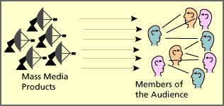
The uses and gratification theory seeks to understand why people actively seek media products for gratification purposes. The theory discusses how users proactively search for media that will not only meet a given need but enhance knowledge, social interactions and diversion. It assumes that members of the audience take an active role in interpreting and integrating media into their own lives. The theory reveals that audiences are responsible for choosing media to meet their needs, suggesting people use the media to fulfill specific gratifications.
According to Katz, Blumler and Gurevitch's research there were 5 components comprising the Uses and Gratifications Model. The components are:
  • “The audience is conceived as active.”
  • “In the mass communication process much initiative in linking gratification and media choice lies with the audience member.”
  • “The media compete with other sources of satisfaction.”
  • “Methodologically speaking, many of the goals of mass media use can be derived from data supplied by individual audience members themselves.”
  • “Value judgments about the cultural significance of mass communication should be suspended while audience orientations are explored on their own terms.”
four primary factors for which one may use the media:
  • Diversion: Escape from routine and problems; an emotional release
  • Personal Relationships: Social utility of information in conversation; substitution of media for companionship
  • Personal Identity or Individual Psychology: Value reinforcement or reassurance; self-understanding, reality exploration
  • Surveillance: Information about factors which might affect one or will help one do or accomplish something
Our social realism film can be related to these factors to explain why an audience may be attracted to see our film. Social realism is often a common conversation as it reflects everyday life therefore we address the idea of personal relationships. 
personal identity can also be applied to our film, as the audience form opinions of the characters portrayed. For example, some viewers, may be able to relate the young boy who we are portraying as innocent but is influenced by bad behaviour because of the environment in which he lives which creates a bond between the on-screen character and the audience, so they are likely to become more invested in the outcome of the film. The audience could also consider the characters as aspirational, which would also affect the intensity of their attraction to the film. By viewing the effects of the characters' corrupt behaviour causing them to be punished may also be considered within our trailer to teach the audience lessons in terms of appropriate behaviour,which falls under the category of surveillance, as the audience form their own conclusions of how they would deal with or avoid the situation. 

Monday, 27 February 2012

The history of social realism

In the 1960s, realist filmaking responded to a period of change in traditional working-class communities. The representation of the working class in new wave films captured a decline, or perceptions of it, in working class life, which the films signified through the rise in consumerism, suburbia and mass culture.

Friday, 24 February 2012

Certification


The British Board of Film Classification (BBFC) had decided to give This is England  an 18 certificate for its use of "realistic violence and racist language". 
Shane Meadows wrote in outrage against the decision to certify his film an 18: By having one piece of violence and one piece of really acute verbal violence I've managed to get an 18 certificate, whereas someone else can slay thousands of people in a single film and that's OK. To be honest I don't understand it because, yes, the film is affecting but I think it's something that someone of 15 can cope with. It's not like it's a film about the 80s that has no value; it's incredibly relevant politically. It's as much about Iraq as it is about the Falklands. It's as much as about England in 2007 as it is about England in1983. We learnt from this that social realisms need to be accessible to a wider audience as they relate to so many people and making This is England an 18 restricted the audience and wiped out a demographic that the film was targeted at.
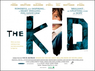
The BBFC certified this British social realism film a 15. Their given reason for certifying 15 to The Kid was as follows:
The frequency of the strong language in the film went beyond what is permitted by the BBFC's Guidelines at '12A'/'12' and required the '15' category at which the 'frequent use of strong language (for example, 'fuck')' is allowed. The film also contains a scene in which a jumble of words and pictures are seen scrawled on a wall which reflect the state of mind of the lead character and this includes an example of very strong language. No particular attention is drawn to the word and its isolated appearance met with the allowance of the Guidelines at '15' which state that 'the strongest terms (for example, 'cunt') may be acceptable if justified by the context'.
The strong violence in the film occurs in two distinct contexts. Firstly, there are scenes of domestic violence as the lead character's parents fight with each other and child abuse where the boy is seen being beaten by his mother. Although these scenes are harrowing they are presented with a lack of detail and were permitted at '15' since they do not dwell on the infliction of pain or injury beyond the point at which the circumstances of the boy's terrible home life are established. Strong violence with bloody injury also features in sequences when the lead character is an adult and has become involved in illegal bare-knuckle fighting contests, but the violence is once again delivered without detail that invites the audience to take pleasure in the pain and injury being caused.
The film also contains scenes of alcohol and prescription drug misuse, as well as scenes of moderate sexual activity.
After looking at the guidelines for a 15 certificate on the BBFC webstie, it is clear that our film is to be certified 15. This is because our film will include frequent strong language but the use of the strongest lanquage will not be used excessively and repetively in an agressive tone. The film also includes mild domestic abuse which includes some violence however it is justified and no sadistic or sexulised violence will be shown in our film and no strong gore will be evident.

Sunday, 19 February 2012

Test shot


Whilst filming the sunset shots we took some photo's of our main character on a cross present at the top of the hill. We really loved this shot, and were going to use it for a poster design idea, however, because we didn't want our narrative to strongly reflect the story of Jacob in the bible, we decided not to use it.

Saturday, 18 February 2012


After researching into idents we decided to use Film 4 and Studio Canal/Optimum releasing. We also certified our film a 15 after careful research. We needed to place these idents onto our ancillary texts and our main product to create a clear chain linking them together.

Friday, 10 February 2012

Age differences


 The Kid
The kid is a social realism/drama that follows a boy from a young age. As the narrative develops so does the boy and it follows him over a period of his life as he grows older.


Jacob
We followed a similar idea in our narrative but did not want it to be so dramatic. We only used one age change from a pre-adolescent boy to him in his late teens. We only reveal this at the end of our trailer and it is the very last shot coming after the title. This acts as an enigma and makes people want to watch the film as the trailer has only revealed parts of the narrative involving the boy when he was young. 

Final shot

This is the last shot in the This is England trailer and it reveals the film title over the shot instead of on a black background. This idea focuses the attention on this boy as a focal character to the film. It also leaves the viewer with this image in mind and not just the film title emphasizing the importance of the narrative.
This is our last shot in our social realism film trailer and we played about with putting the title after this shot in a black background however we thought it looked rushed and unprofessional, it also meant this shot would not have been as long and we wanted it to be a focal point in our trailer.
We put the title text over the shot in the font that we had used on our poster designs. We also used blue text to acts as a complementary colour to the orange sky so that the last shot is visually impressive. Because the trailer is a teaser trailer and there is not a lot of time to give away detailed information on the film we only have a short space in which to fit the title in, therefore we blurred the shot as the text appears acting as a smooth transition and drawing more attention to the title.