Showing posts with label Social realism. Show all posts

Wednesday, 18 April 2012

Evaluation Question 2


 2. How effective is the combination of your main product and ancillary texts?

To create a successful combination between our main product and ancillary texts we needed to ensure they all had a central theme that enabled them to link together in a way that made it clear they were promoting our film. To make this effective we used several motifs throughout our poster, website and trailer.


To start with we used the same typography on both our poster and in our trailer. The font was important to our poster as we felt, although our poster is a good representation of our film, it did not fully fit the conventions of a social realism poster and perhaps signified a drama more; However the typography we chose is faded and cracked, we thought this showed corruption and fragmentation which helped to portray social realism more as it connotes hardships. We used the same font on a shot in a film trailer, however we struggled to put the font onto our website because of technical difficulties.


This is our second to last shot in our film trailer. It is clear from the juxtaposition of our poster and this shot from our trailer that there is a strong link and the two combine well. Not only have we used the same font but also the colour scheme is very similar. The use of oranges and yellows resonates throughout our texts. We used the sunset and it is a memorable shot in our trailer as it stands out against the dull colours of the rest of the shots. We used the sunset to create the image of hope, but the action of our protagonist walking as a silhouette into the sunset and away from the camera evokes emotion and leaves mystery in the ending such as the ending in Fishtank, this connotes the social realism genre as there is not a happy ending, in fact there should be no proper conclusion as it needs to convey real life and reality as best as possible. We also used the silhouette in the poster using our protagonist however he remains unidentifiable so our film does not come across as a film about a singular boys 'sob story' but about a type of boy that many people can associate with.


On our website we used the colour orange to link it to both the poster and the trailer even though we used a blue font in the trailer the sunset creates the orange colour scheme. We also placed the Jury prize on the right hand side making the website look more professional, advertising the award even more and creating another link between the trailer and the website as we place the award in our trailer.


We placed the credits shown above on both the trailer and the teaser trailer. These credits are exactly the same on the both and include the same information successfully combining the trailer and the poster. These credits give information such as indents, certification, actors and directors etc. They also contain the website thus linking all of our texts together. This makes it all seem professional and works as a marketing device.

Our website uses the picture to left as its background. Once again we have used our protagonist as the focal point. Although he is a silhouette on our poster which hides his identity and in this picture we see him front on, the hood acts as a barrier and the idea of blurring his identity is continued. It keeps the character as an enigma.
Shows same costume to what is
being worn in website photograph.
The website probably has less correlation to the other two texts purely because the poster and trailer use almost identical images and we were able to use the font. However they still work as a combination because we have used the same costume in this photograph and in parts of the trailer and we have continued the idea of our protagonist wearing a hood which we were inspired by after watching Fishtank and deconstructing the poster.


 A tagline is important in the advertisement and marketing stages of film. A tagline is a form branding slogan in which the aim is to create a memorable phrase that will attempt to epitomise the product, in this case our film. The tagline, if successful should reinforce the audiences memory of the film and in some case a tagline can be so successful it is used as a saying in popular culture, for example 'Be afraid. Be very afraid." (The Fly) and "A long time ago, in a galaxy far, far away." (Star Wars). Our tagline is, "It takes a lifetime to gain an old friend" referring to the unusual friendship formed between our protagonist, Jacob, and the old man character. We placed our tagline underneath the title on the poster in a slightly darker colour, we also put the tagline on our website underneath the title also. This should make the tagline more familiar and acts as a marketing device.


To combine our ancillary texts and main products together not only do we create the same tone using colour, typography, actors and a tagline but we used Facebook and Twitter to act as a form of advertisement. We placed Facebook and Twitter links on the website which allows for audience feedback and participation, we also put these links on our blog. We also used YouTube to circulate our finished product and put links on the website also, this allows for feedback to so we can learn what we did wrong and what bits we did right. The blog also contains these links and the website links back to the blog also, this is important for our media project as it allows people to understand our direction and see the planning and research behind our finished product.

Conclusion:
Overall the combination of our main product and ancillary texts seems to work effectively. The poster and trailer are clearly linked as they use the same font and colour scheme, this is important as it sets the tone for our film, the poster picks out a aesthetically pleasing part of our film but it also subverts the social realism genre which why at first we debated whether to use it or not. We finally decided to chose the poster as we felt it was a good signifier of our narrative that did not give too much away but set the tone and mood, it also attracted our audience and after asking people to pick their favorite poster they were drawn to our final one. Our website does not fit in with the theme of the sunset as much however it does include a picture of our protagonist and the costume remains the same. I believe we effectively created a combination however we would have liked to have carried more elements through onto the website and the blog such as the font.
What have you learnt through audience feedback?

Our imagined audience:

  • Our imagined audience are aged 15 to 40.
  • They are a more avid watchers of film, with more cultural and political awareness.
  • They listen to a wider variety of music such as acoustic, alternative, singer/songwriter, etc. 
  • Have a greater knowledge of British social realism conventions.
  • Female or male though there may be slightly larger audience of females because of the nature of the narrative. 
  • They may also have watched films such as This is England and Fishtank
This is merely an ideal and of course as in all things there are exceptions and abnormalities. For example within the age range you will probably have a spill over into the older age ranges. Uses&Gratifications theory can be applied to our target audience as part of it says that audiences use texts for personal relation ships and personal identity.

Teacher feedback: when we showed our trailer to our teachers over the course of its production there were various tweaks suggested to us from them, mostly they were to do with transitions and shot lengths.  A few times we asked them there advice on whether to include certain shots and there feedback was useful in our overall finished product.

    This pie chart is response we had from the screening of our trailer, we asked what genre they thought our film was, as you can see the answer they gave was predominantly social realism with a scattering of coming of age. Though our film is a social realism it could be interpreted as a coming of age film which is what our narrative is partly about. Two responses came back as adventure as you can see from this link they are obviously thinking of different codes and conventions to us.  Example of an adventure film, Indiana Jones
You could also apply this anomaly too reception theory which says that viewers view texts differently depending on cultural backgrounds and life experiences.


The bar chart below is to show the response we got from another question asked at our screening of our trailer. The question that we asked was how well they thought our trailer fitted with our genre, overall we got a very positive response apart from the one result of not very well however if you cross reference that answer with the genre that they believed it was, adventure, then this can be mainly discounted.


At the end of the screening the audience were also asked what there favourite part of the trailer was, with a lot of the saying the final scene with the hood. One person said "its a special moment in the trailer and gives you a real insight into what the film is about" This perhaps shows that we gave too much of our narrative away but i think the progression and the content of our narrative is more important than just knowing what our film would be about.

we created a poll on our blog as well to increase interactivity and to ask what age our protagonist the audience thought he should be. we dismissed the idea of using a female protagonist as we thought that this would create more problems than benefits to our trailer. 8 people voted on our poll and with 6 of those votes on the thirteen to fifteen category we decided that was the prudent to choose. The actor of Jacob is in fact thirteen, that isn't outlined in our trailer and he could be seen as older.


We started our research initially with a questionnaire, which we placed on survey monkey. Using survey monkey allowed us to easily share our questionnaire on Facebook and send it by email which maximised the amount of exposure to it.  Our questionnaire consisted of questions about genre and what people enjoy the most about and within that genre. The most important part of this was the questions about genre, as we needed to choose one at that time to be able to begin the production of our trailer. Not many people chose British social realism however we decided on a social realism film because we thought it would be the most interesting and challenging film to create.


when doing our poster designs  we had trouble deciding which one too choose, eventually we narrowed it down too two designs as shown on the left, we did not conduct a formal questionnaire or produced a poll or something similar however we asked a lot of people for there feedback and comments. Both posters were received with very positive feedback, people said they liked the urbanised feel of the one below and the fact that his expression could be that of exasperation and futility but showed the innocence of the character. The first poster is in fact our final one and the one that people and our group personally preferred. people contrary to statements about liking the urbanised setting Said they also liked the naturalistic setting and the use of the silhouette. Our groups opinion on why we chose this was similar to our feedback but we also liked symbolism of the sun.


Here is some feedback from our YouTube account:


Sunday, 15 April 2012

Nil by mouth


Nil by Mouth is a 1997 British social realism film portraying a family of characters living in South East London. It was Gary Oldman's debut as a writer and directorThe title is a medical instruction meaning that a patient must not take food or water.

Tyrannosaur

Tyrannosaur is a 2011 BAFTA award winning British social realism film written and directed by Paddy Considine, his first feature film.
The film depicts an environment similar to what Considine witnessed growing up on a council estate in the Midlands. The film's title is a metaphor, the meaning of which is revealed in the film.
Plot
"Joseph, an unemployed widower, plagued by violence and a rage that is driving him to self-destruction, undergoes a life change after killing his dog in a fit of rage. Desperate to change his ways and get out of his unpleasant past and surroundings, he earns a chance of redemption when by chance he becomes close to local charity shop worker Hannah, a respectable wholesome and kindly Christian woman who takes pity on him, and they become close friends. However Hannah has a dark secret of her own which threatens to plunge Joseph back into his former life."


We chose to look at the Tyrannosaur poster because we felt it subverted codes and conventions of a social realism film. The poster is unusual and original, it contains the skeleton of a dinosaur which works in harmony with the title of the film, however it does not signify a social realism film nor a drama. This intrigued us as a group and helped us to choose our final poster as our poster did not fit the codes and conventions of a social realism either. This is because we used a lot of nature and did not signify working class, poverty or urbanised areas. To look at the poster closely it is clear that there are urban houses in the background, however from a distance the poster, without the skeleton, almost looks like a horror poster as the man standing between the towering trees seems to be holding a weapon, however he is really holding a bunch of flowers. The poster is chilling, cold because of its sepia tone and seemingly tense, however the layered effect of the poster that gradually draws the eye down through the menacing trees to the small yet vivid man down through the undergrowth to the skeleton is somewhat beautiful. The idea that something horrific lies beneath is strongly connoted and the use of flowers that could be mistaken for a weapon ignites the idea of the boundaries between what is good and bad. This poster is powerful and original, we want to create a similar feel but perhaps not so haunting.


Wednesday, 29 February 2012

Film Posters


- Clear, easy to read font is used
- Protagonist is on poster
- Title is in the center of the thirds
- A tag line is used
- The clothing the characters wear in the poster gives away their personality
- Background usually shows a feature of city life/film location
- Other films created by the director are sometimes mentioned
- The first item the eye is usually drawn to is the title     
- white is a dominating colour commonly used    


Tuesday, 28 February 2012

Uses & Gratification Theory

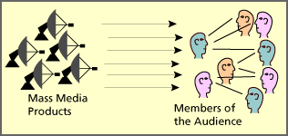
The uses and gratification theory seeks to understand why people actively seek media products for gratification purposes. The theory discusses how users proactively search for media that will not only meet a given need but enhance knowledge, social interactions and diversion. It assumes that members of the audience take an active role in interpreting and integrating media into their own lives. The theory reveals that audiences are responsible for choosing media to meet their needs, suggesting people use the media to fulfill specific gratifications.
According to Katz, Blumler and Gurevitch's research there were 5 components comprising the Uses and Gratifications Model. The components are:
  • “The audience is conceived as active.”
  • “In the mass communication process much initiative in linking gratification and media choice lies with the audience member.”
  • “The media compete with other sources of satisfaction.”
  • “Methodologically speaking, many of the goals of mass media use can be derived from data supplied by individual audience members themselves.”
  • “Value judgments about the cultural significance of mass communication should be suspended while audience orientations are explored on their own terms.”
four primary factors for which one may use the media:
  • Diversion: Escape from routine and problems; an emotional release
  • Personal Relationships: Social utility of information in conversation; substitution of media for companionship
  • Personal Identity or Individual Psychology: Value reinforcement or reassurance; self-understanding, reality exploration
  • Surveillance: Information about factors which might affect one or will help one do or accomplish something
Our social realism film can be related to these factors to explain why an audience may be attracted to see our film. Social realism is often a common conversation as it reflects everyday life therefore we address the idea of personal relationships. 
personal identity can also be applied to our film, as the audience form opinions of the characters portrayed. For example, some viewers, may be able to relate the young boy who we are portraying as innocent but is influenced by bad behaviour because of the environment in which he lives which creates a bond between the on-screen character and the audience, so they are likely to become more invested in the outcome of the film. The audience could also consider the characters as aspirational, which would also affect the intensity of their attraction to the film. By viewing the effects of the characters' corrupt behaviour causing them to be punished may also be considered within our trailer to teach the audience lessons in terms of appropriate behaviour,which falls under the category of surveillance, as the audience form their own conclusions of how they would deal with or avoid the situation. 

Tuesday, 3 January 2012

This is England - Trailer


The film This is England is a social realism film, directed by Shane Meadows and had a buget estimated at £1,500,000

Monday, 10 October 2011

Sound Examples


This is the soundtrack to This is England. It is simple as only one instrument is used. The music is sombre and melancholic. The music is used as a motif throughout the film to signify traumatic moments in the narrative, it also acts as contrapuntal sound over the top of violence. We first considered using music similar to this however for a trailer we thought it was too morose and might give too much of the narrative away.


This music is an acoustic version of a mainstream piece of music by skrillex. This music is simple but effective. The use of guitar only as a soundtrack works well with a Social realism film as the films depict real life and everyday characters and this kind of music does not distract from the onscreen action and does not glorify working class life. 
    
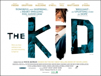
After looking at many social realism trailers, such as somers town, Fishtank and The kid we noticed the music was primarily acoustic guitar or mainstream  music from the time, for example in This is England. As we cannot use copyrighted music we decided to use an original acoustic music. This piece is simple yet memorable, for these reasons we feel this would make a suitable soundtrack for our trailer.


Thursday, 29 September 2011

Fishtank poster deconstruction


  • Heroic- proportionally she is filling the majority of the poster, this suggests a need to overcome her background and economic struggles. small buildings in the background: tower blocks, flats connote council estate and working class.
  • Weather behind is blue sky and clouds as well as sunshine gives a sense of hope and happiness, however, this is contrasted with her serious and distant expression, suggesting this happiness is faced with trouble and disruption.
  • The font/text is bold- orange font contrasts with blue sky. this represents the girl contrasting with her lifestyle in society.
  • The light shines from the left creating shadow on her face, connoting a side of darkness and unhappiness within her character.
  • She is wearing a hooded jumper, portraying the "hoody" stereotype- associated with having to act tough and stick up for herself. The media represents "hoodies" as intimidating and are typically referred to as ASBO's. Her hood acts as a form of identity, the wind appears to inflate the hood as if to show her true identity.
  • Small white font informs the audience of actor names, awards, success of the film and ratings. This text is positioned at the bottom of the poster because is it a social realism film and so actors are not famous.
  • Fishtank as a title demonstrates the idea of captivity and a sense of claustrophobia within society. This shows the idea that we are all fishes trapped in society and cannot escape however hard we try.

Tuesday, 27 September 2011

History of British social realism

Social Realism

Social realism, also known as socio-realism, is an artistic movement where life struggles such as racial and social injustices and economic hardship are portrayed through the visual. The subject depicted is often showing the working class and their activities as heroic. In the artistic movement, the image depicts a scene that would usually convey a political and social protest and would typically be edged with satire. This was reflected in the social realism movement in the cinema with Britain adopting it as its main cinematic style. The idea of working class hardships was portrayed in films taken from Dickens and Thomas Hardy. One of the first film makers to establish the change from pictorialsm to naturalism was James Williamson. His films are considered innovative as they offer a narrative which was not common in earlier films from this time, in 1902 his films became available in America and influenced other film makers to construct a narrative through a number of shots.
The social realist films typically show working class struggles and how they are dealt with in early day life. Mostly set in the north films such as ‘Kes’ and ‘Billy Elliot’ show the struggles of young boys from a working class background.