IN WHAT WAYS DOES YOUR MEDIA PRODUCT USE, DEVELOP OR CHALLENGE FORMS & CONVENTIONS OF REAL MEDIA PRODUCTS?
Trailer:We researched the history of britsh social realism to help us establish the codes and conventions of our genre. We also deconstructed the trailers of existing social realism films. The films that most influenced us were:
- This is England
- Fish Tank
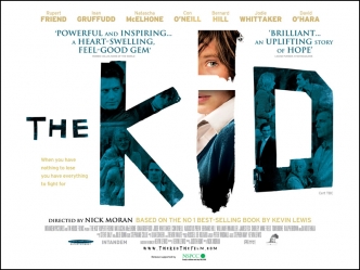
- The Kid
From researching trailers we found that to create a successful trailer it should involve an ident, the title of the film and the release date. We also noticed that there is also some form of disequilibrium that is displayed.
We wanted our film to seem new and modern, so that a young audience can relate to the protagonist. We developed the conventions of real media products as we decided that we wanted the mother to be young, similar to the mother in fish tank as Britain is associated with teen pregnancy.
Trailer:We researched the history of britsh social realism to help us establish the codes and conventions of our genre. We also deconstructed the trailers of existing social realism films. The films that most influenced us were:
- This is England
- Fish Tank
- The Kid
From researching trailers we found that to create a successful trailer it should involve an ident, the title of the film and the release date. We also noticed that there is also some form of disequilibrium that is displayed.
We wanted our film to seem new and modern, so that a young audience can relate to the protagonist. We developed the conventions of real media products as we decided that we wanted the mother to be young, similar to the mother in fish tank as Britain is associated with teen pregnancy.
We also developed the idea of an unexpected friendship of an elderly man and a teenage boy. This was partly inspired by the relationship between Kevin and his foster father in The Kid.
 From researching The Kid we decided we wanted to use a transaction of age from a pre-adolescent boy to him in his late teens. We only reveal this at the end of our trailer and it is the very last shot coming after the title. This acts as an enigma and makes people want to watch the film as the trailer has only revealed parts of the narrative involving the boy when he was young, which is different to the trailer of The Kid which constantly switches between the three different ages.
 Our teaser trailer uses the narrative of Todorov, although there is not much equilibrium shown at the beginning, as we show the protagonist's mother poking him in the face when he comes home. We wanted to develop the codes and conventions of social realism to create sympathy towards our protagonist therefore we used an echo effect over the mother's dialogue. The repitition echo effect suggests that everytime he goes into the house his mother is abusive towards him. We decided to go for a more subtle form of abuse, rather than extreme violence as our film is certified 15. The echo also shows how he is disconnected from his home, which is juxta positioned with shots of him with the elderly man where the character Jacob is shown with a happier expression. We also used a slow motion effect to show the significance of abuse in the shot where water is thrown and in the face poke shot in order to create sympathy towards the protagonist. The trailer then has a cliffhanger ending as it has no complete resolution, but there is a new sense of equilibrium as the walking in the sunset creates a sense of hope, similar to the ending of Fishtank.
Poster:From researching other social realism posters we established they usually contain:
- Clear, easy to read font is used
- Protagonist is on poster
- Title is in the center of the thirds
- A tag line is used
- The clothing the characters wear in the poster gives away their personality
- Background usually shows a feature of city life/film location
- Other films created by the director are sometimes mentioned
- The first item the eye is usually drawn to is the title
- White is a dominating colour commonly used
- The first item the eye is usually drawn to is the title
- White is a dominating colour commonly used


The shot is taken at an angle so the we see the protagonists profile, his expression is important in this poster as there is not a lot going on else where in the composition. His body language is relaxed but his expression more relieved. Because his eyes are closed it gives the impression that he is trying to shut out the world which relates to our narrative. The wall that we used in the poster is white which, after research of social realism film posters, we found often used, it also appears gritty and worn adding the working class element to the poster. Although this poster follows codes and conventions of a social realism poster we decided not to use it. Instead we decided to subvert the conventions by choosing the sunset as from our feedback we discovered people found it more intruiging as the identity of the protagonist is a silhouette. There is no sign of a working class or an urbanised location, which is usually established in a social realism film poster, we felt that by showing an urban location it would suggest our film is associated with gang culture, which is not what we wanted to portray. The bright colours of the sunset would suggest an element of hope.
From researching other social realism posters we found ours was similar to Tyrannosaur
Website:
From researching other social realism posters we found ours was similar to Tyrannosaur
Website:
When researching other social realism film posters we were particularly inspired by This is England and London to Brighton


We really liked the layout of the London to Brighton film website as the pictures were links to different areas on the website. However were unable to create something similar at the same quality. We also like the ratings and film awards which we decided to include in our own website.


Unfortunately we were unable to use the same font which we had used in both our trailer and film poster.
We chose to use a black and white background so that the writing and the trailer would stand out, we also wanted it to contrast with the bright poster to show a more serious side to our film.
The background picture is taken against a brick wall and there is graffitti on it. Although we did not want our film to promote gang culture, we felt this would be a good background for our website as it may help attract a younger audience who constantly use the internet.
We would have liked there to have been music playing when you are on the website, similar to This is England, but unfortunately we were unable to do this.
We have links to our twitter, facebook and blogger page which we found were on other film websites.
Overall we believe our media products follow the main conventions of a British social realism apart from the poster which subverts the conventions of existing posters we looked at.