Showing posts with label This is England. Show all posts

Thursday, 19 April 2012

Evaluation Question 1

IN WHAT WAYS DOES YOUR MEDIA PRODUCT USE, DEVELOP OR CHALLENGE FORMS & CONVENTIONS OF REAL MEDIA PRODUCTS?

Trailer:We researched the history of britsh social realism to help us establish the codes and conventions of our genre. We also deconstructed the trailers of existing social realism films. The films that most influenced us were:
- This is England
- Fish Tank
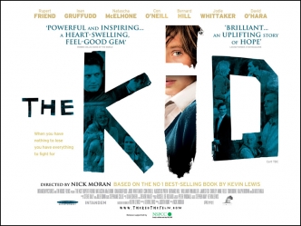
- The Kid
From researching trailers we found that to create a successful trailer it should involve an ident, the title of the film and the release date. We also noticed that there is also some form of disequilibrium that is displayed.

We wanted our film to seem new and modern, so that a young audience can relate to the protagonist. We developed the conventions of real media products as we decided that we wanted the mother to be young, similar to the mother in fish tank as Britain is associated with teen pregnancy.

We also developed the idea of an unexpected friendship of an elderly man and a teenage boy. This was partly inspired by the relationship between Kevin and his foster father in The Kid.
                                                                                 
 From researching The Kid we decided we wanted to use a transaction of age from a pre-adolescent boy to him in his late teens. We only reveal this at the end of our trailer and it is the very last shot coming after the title. This acts as an enigma and makes people want to watch the film as the trailer has only revealed parts of the narrative involving the boy when he was young, which is different to the trailer of The Kid which constantly switches between the three different ages.
                                                                                 
Our teaser trailer uses the narrative of Todorov, although there is not much equilibrium shown at the beginning, as we show the protagonist's mother poking him in the face when he comes home. We wanted to develop the codes and conventions of social realism to create sympathy towards our protagonist therefore we used an echo effect over the mother's dialogue. The repitition  echo effect suggests that everytime he goes into the house his mother is abusive towards him. We decided to go for a more subtle form of abuse, rather than extreme violence as our film is certified 15. The echo also shows how he is disconnected from his home, which is juxta positioned with shots of him with the elderly man where the character Jacob is shown with a happier expression. We also used a slow motion effect to show the significance of abuse in the shot where water is thrown and in the face poke shot in order to create sympathy towards the protagonist. The trailer then has a cliffhanger ending as it has no complete resolution, but there is a new sense of equilibrium as the walking in the sunset creates a sense of hope, similar to the ending of Fishtank.

Poster:From researching other social realism posters we established they usually contain:
- Clear, easy to read font is used
- Protagonist is on poster
- Title is in the center of the thirds
- A tag line is used
- The clothing the characters wear in the poster gives away their personality
- Background usually shows a feature of city life/film location
- Other films created by the director are sometimes mentioned
- The first item the eye is usually drawn to is the title 
- White is a dominating colour commonly used

 The shot is taken at an angle so the we see the protagonists profile, his expression is important in this poster as there is not a lot going on else where in the composition. His body language is relaxed but his expression more relieved. Because his eyes are closed it gives the impression that he is trying to shut out the world which relates to our narrative. The wall that we used in the poster is white which, after research of social realism film posters, we found often used, it also appears gritty and worn adding the working class element to the poster. Although this poster follows codes and conventions of a social realism poster we decided not to use it. Instead we decided to subvert the conventions by choosing the sunset as from our feedback we discovered people found it more intruiging as the identity of the protagonist is a silhouette. There is no sign of a working class or an urbanised location, which is usually established in a social realism film poster, we felt that by showing an urban location it would suggest our film is associated with gang culture, which is not what we wanted to portray. The bright colours of the sunset would suggest an element of hope.

From researching other social realism posters we found ours was similar to
Tyrannosaur

Website:
When researching other social realism film posters we were particularly inspired by This is England and London to Brighton
We really liked the layout of the London to Brighton film website as the pictures were links to different areas on the website. However were unable to create something similar at the same quality. We also like the ratings and film awards which we decided to include in our own website.


We decided to conform to the convention in which the majority of film websites have the trailer displayed on the home page.

Unfortunately we were unable to use the same font which we had used in both our trailer and film poster.

We chose to use a black and white background so that the writing and the trailer would stand out, we also wanted it to contrast with the bright poster to show a more serious side to our film.

The background picture is taken against a brick wall and there is graffitti on it. Although we did not want our film to promote gang culture, we felt this would be a good background for our website as it may help attract a younger audience who constantly use the internet.

We would have liked there to have been music playing when you are on the website, similar to This is England, but unfortunately we were unable to do this.

We have links to our twitter, facebook and blogger page which we found were on other film websites.


Overall we believe our media products follow the main conventions of a British social realism apart from the poster which subverts the conventions of existing posters we looked at.

Wednesday, 29 February 2012

Film Posters


- Clear, easy to read font is used
- Protagonist is on poster
- Title is in the center of the thirds
- A tag line is used
- The clothing the characters wear in the poster gives away their personality
- Background usually shows a feature of city life/film location
- Other films created by the director are sometimes mentioned
- The first item the eye is usually drawn to is the title     
- white is a dominating colour commonly used    


This is England - Website Deconstruction


  • Background is of high rise flats usually found in the city, however this photo has luscious green grass and blue sky which creates a sense of freedom.
  • The colour schemes are in keeping with the film title 'This is England' and is made up from the Union Jack.
  • The Font is in the same colours of red, white and blue and is a basic, bold font in capital letters. 
  • On the opening page, the trailer is present and plays as soon as the site is entered making it the main focus of the website.
  • There are 2 highlights towards the DVD and another towards all film merchandise. The header of the page shows when the DVD is out and the bottom left corner shows the image of the DVD and a link to pre-order.
  • There are competitions on the site which lead to win prizes of the film merchandise. 
  • Awards are present down the right hand side of the website showing the quality of the film.
  • A Tab takes the viewer to multiple reviews of the film from Newspapers, Film critic websites and celebrities.
  • Along the bottom of the website are the film idents and a link to the main producers own website.


Friday, 24 February 2012

Certification


The British Board of Film Classification (BBFC) had decided to give This is England  an 18 certificate for its use of "realistic violence and racist language". 
Shane Meadows wrote in outrage against the decision to certify his film an 18: By having one piece of violence and one piece of really acute verbal violence I've managed to get an 18 certificate, whereas someone else can slay thousands of people in a single film and that's OK. To be honest I don't understand it because, yes, the film is affecting but I think it's something that someone of 15 can cope with. It's not like it's a film about the 80s that has no value; it's incredibly relevant politically. It's as much about Iraq as it is about the Falklands. It's as much as about England in 2007 as it is about England in1983. We learnt from this that social realisms need to be accessible to a wider audience as they relate to so many people and making This is England an 18 restricted the audience and wiped out a demographic that the film was targeted at.
The BBFC certified this British social realism film a 15. Their given reason for certifying 15 to The Kid was as follows:
The frequency of the strong language in the film went beyond what is permitted by the BBFC's Guidelines at '12A'/'12' and required the '15' category at which the 'frequent use of strong language (for example, 'fuck')' is allowed. The film also contains a scene in which a jumble of words and pictures are seen scrawled on a wall which reflect the state of mind of the lead character and this includes an example of very strong language. No particular attention is drawn to the word and its isolated appearance met with the allowance of the Guidelines at '15' which state that 'the strongest terms (for example, 'cunt') may be acceptable if justified by the context'.
The strong violence in the film occurs in two distinct contexts. Firstly, there are scenes of domestic violence as the lead character's parents fight with each other and child abuse where the boy is seen being beaten by his mother. Although these scenes are harrowing they are presented with a lack of detail and were permitted at '15' since they do not dwell on the infliction of pain or injury beyond the point at which the circumstances of the boy's terrible home life are established. Strong violence with bloody injury also features in sequences when the lead character is an adult and has become involved in illegal bare-knuckle fighting contests, but the violence is once again delivered without detail that invites the audience to take pleasure in the pain and injury being caused.
The film also contains scenes of alcohol and prescription drug misuse, as well as scenes of moderate sexual activity.
After looking at the guidelines for a 15 certificate on the BBFC webstie, it is clear that our film is to be certified 15. This is because our film will include frequent strong language but the use of the strongest lanquage will not be used excessively and repetively in an agressive tone. The film also includes mild domestic abuse which includes some violence however it is justified and no sadistic or sexulised violence will be shown in our film and no strong gore will be evident.

Friday, 10 February 2012

Final shot

This is the last shot in the This is England trailer and it reveals the film title over the shot instead of on a black background. This idea focuses the attention on this boy as a focal character to the film. It also leaves the viewer with this image in mind and not just the film title emphasizing the importance of the narrative.
This is our last shot in our social realism film trailer and we played about with putting the title after this shot in a black background however we thought it looked rushed and unprofessional, it also meant this shot would not have been as long and we wanted it to be a focal point in our trailer.
We put the title text over the shot in the font that we had used on our poster designs. We also used blue text to acts as a complementary colour to the orange sky so that the last shot is visually impressive. Because the trailer is a teaser trailer and there is not a lot of time to give away detailed information on the film we only have a short space in which to fit the title in, therefore we blurred the shot as the text appears acting as a smooth transition and drawing more attention to the title.

Tuesday, 3 January 2012

This is England - Trailer


The film This is England is a social realism film, directed by Shane Meadows and had a buget estimated at £1,500,000

Monday, 10 October 2011

Sound Examples


This is the soundtrack to This is England. It is simple as only one instrument is used. The music is sombre and melancholic. The music is used as a motif throughout the film to signify traumatic moments in the narrative, it also acts as contrapuntal sound over the top of violence. We first considered using music similar to this however for a trailer we thought it was too morose and might give too much of the narrative away.


This music is an acoustic version of a mainstream piece of music by skrillex. This music is simple but effective. The use of guitar only as a soundtrack works well with a Social realism film as the films depict real life and everyday characters and this kind of music does not distract from the onscreen action and does not glorify working class life. 
    
After looking at many social realism trailers, such as somers town, Fishtank and The kid we noticed the music was primarily acoustic guitar or mainstream  music from the time, for example in This is England. As we cannot use copyrighted music we decided to use an original acoustic music. This piece is simple yet memorable, for these reasons we feel this would make a suitable soundtrack for our trailer.


Thursday, 29 September 2011

This is England research and deconstruction


This moment in the film shows Shaun as he takes the side of combo because he can relate to him in regards to the Falkland’s war, Shaun sees Combo as a mentor figure and gets wrapped up in his nationalist and racist views. The atmosphere changes from a comical mood with Shaun being chased round the shop by the owner, Shaun uses racial abuse however the shopkeeper can handle it as Shaun is young and naive, with the entrance of combo as he reveals his weapon it is shocking and dramatic, the audience see the danger that Shaun is ignorantly getting into. This scene needs no music as the language and images are dramatic enough on their own.  


 We see Shaun at the end of his journey as he experiences Combos xenophobia when he severely attacks milky, the only black member of the group. He abandons Combo and discards the English flag he gave him, however it is ironically patriotic as he throws it into the sea. The music is mellow and melancholic, a cover of the smiths which is music from the time making the realism more authentic. The location is strangely beautiful, perhaps made more so through the music and emotion created through the loneliness of Shaun. He walks down a path, almost a path of discovery as his joyful views of England have been corrupted by the Nazi ideology of combo. The scene ends with an extreme close up of Shaun, his face almost aged and worn, his expression melancholic as if he has given up, a direct look at the camera ends the scene, this contact is moving and brings to life the hole film as Shaun breaks the fourth wall.